Lead Designer
UX, PM, Development
6 Weeks
Figma, UserTesting.com, Confluence
In 2021 DreamBox Learning acquired a reading product called Reading Plus which supports students in grades 3-5, and recently released a reading product, Reading Park, for students in grades K-2.
Educators need a unified reporting system, allowing access to their Reading Park (K-2) and Reading Plus (3-5) data in the same dashboard. The solution needs to leverage the existing Reading Plus platform that some users are already familiar with.
How can we give our DreamBox Reading customers access to their Reading Park data through the existing Reading Plus dashboard?
#1 | Do no harm to our existing Reading Plus educators and administrators — Reading Plus educators receive the same reports and use nearly the same navigation they are used to.
#2 | Users can easily distinguish what reports are available for Reading Park students versus Reading Plus students.
#3 | Users are presented with the current DreamBox Learning brand.
#1 | Reports and metrics are different between the Reading Park product and the Reading Plus product — Users might be confused by the data variance.
#2 | Reading Plus customers have high CSAT (based on previous NPS studies and customer feedback) that we don’t want to disrupt.
#3 | New product and new branding changes at the same time could be overwhelming for existing Reading Plus users.
We started the ideation process by looking at the existing product and conducting an audit. This was a critical part of the process because the Reading Plus dashboard had not been touched since DreamBox acquired it, and as a result, the design team had to spend a good deal of time learning how to use the product.
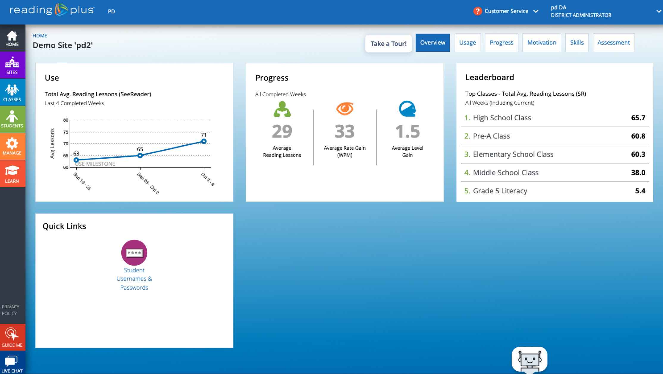
The dashboard currently only supports Reading Plus data.
Color is not being used in a meaningful way. The opportunity to use color to draw attention to important data insights is lost.
The hierarchy and visual design of the dashboard could be improved to help guide the user to what they are looking for.
The current design feels dated and doesn't reflect the DreamBox Learning brand.
We conducted unmoderated user testing on two concept flows with 30 total users.
15 prospective customers, and 15 current Reading Plus users.
Gain a better understanding of how users prefer to view data for Park and Plus.
Identify any usability issues or points of confusion with the combined experience.
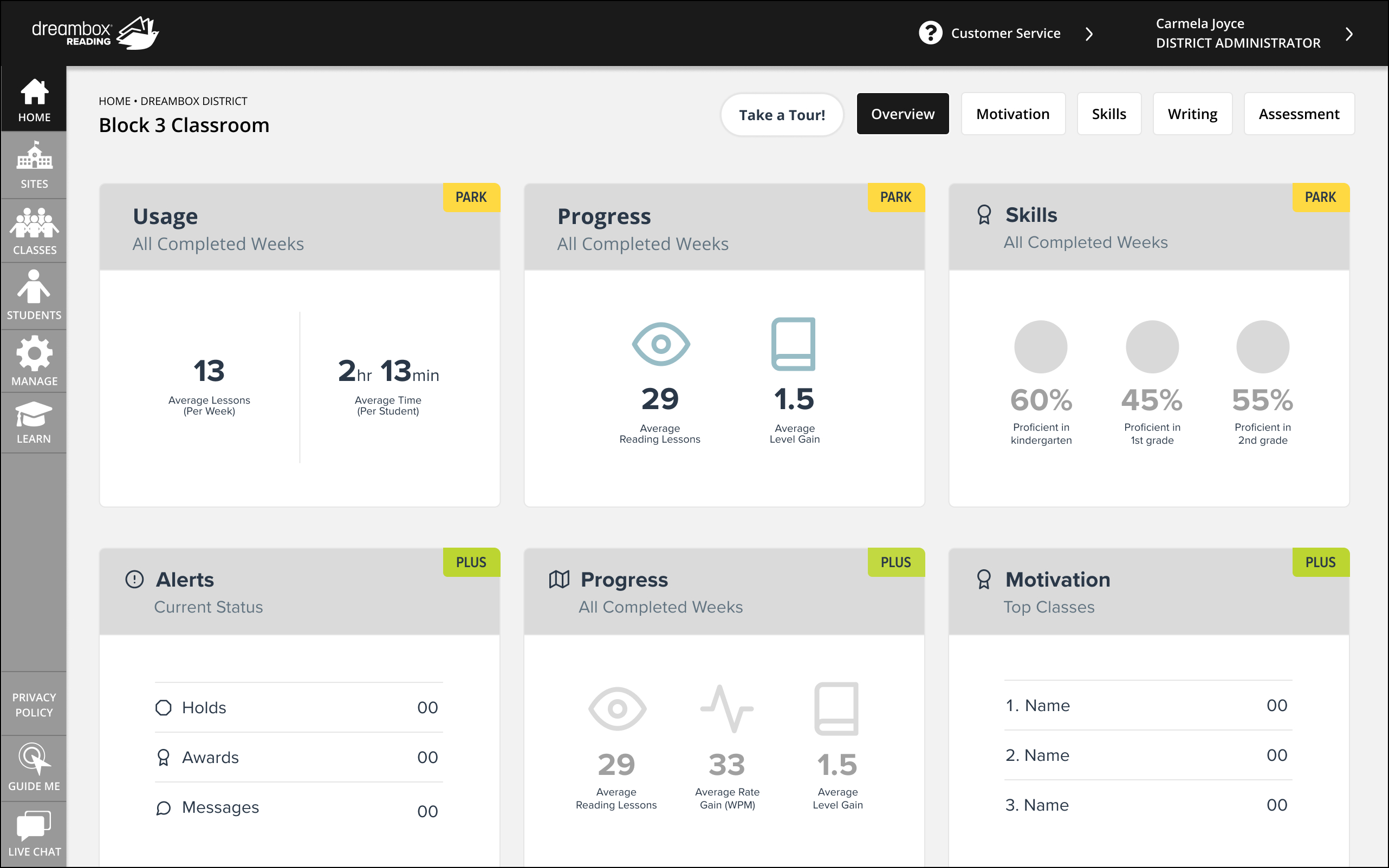
In this version, users see data from both products in a single space.
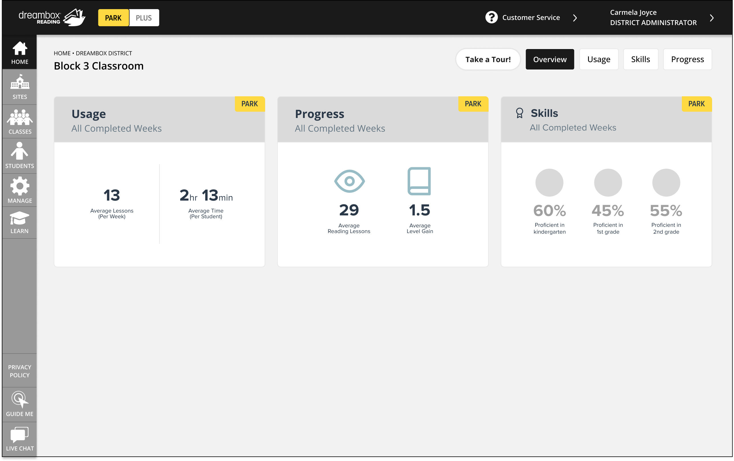
In this version, users will use a toggle at the top of the navigation to select which product they want to view data for.
26/30 participants preferred concept #1 (combined reporting).
When using the toggle, some users remarked that it might get confusing toggling back and forth, and hard to keep track of where they are.
When asked how “easy to navigate” to prototype was, concept #1 earned an average score of 4.2/5 while concept #2 earned an average score of 4/5.
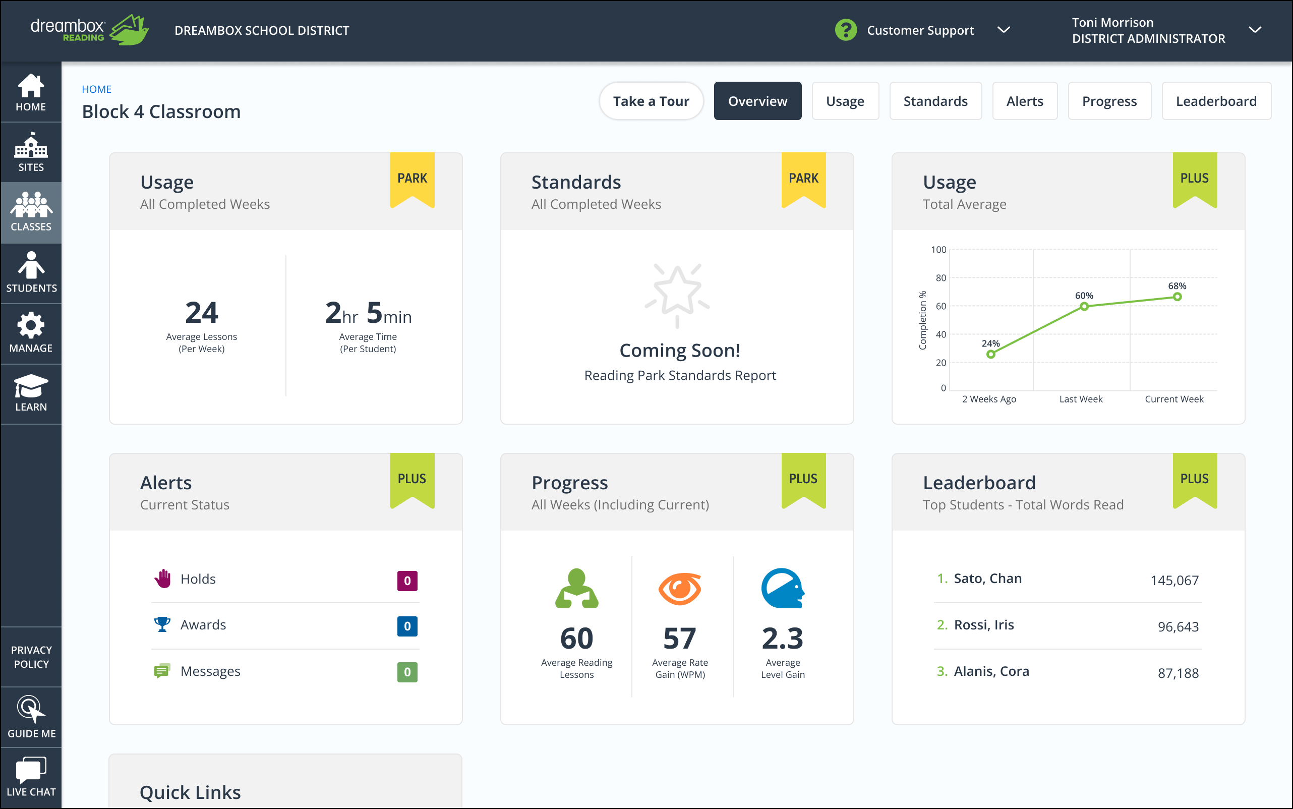
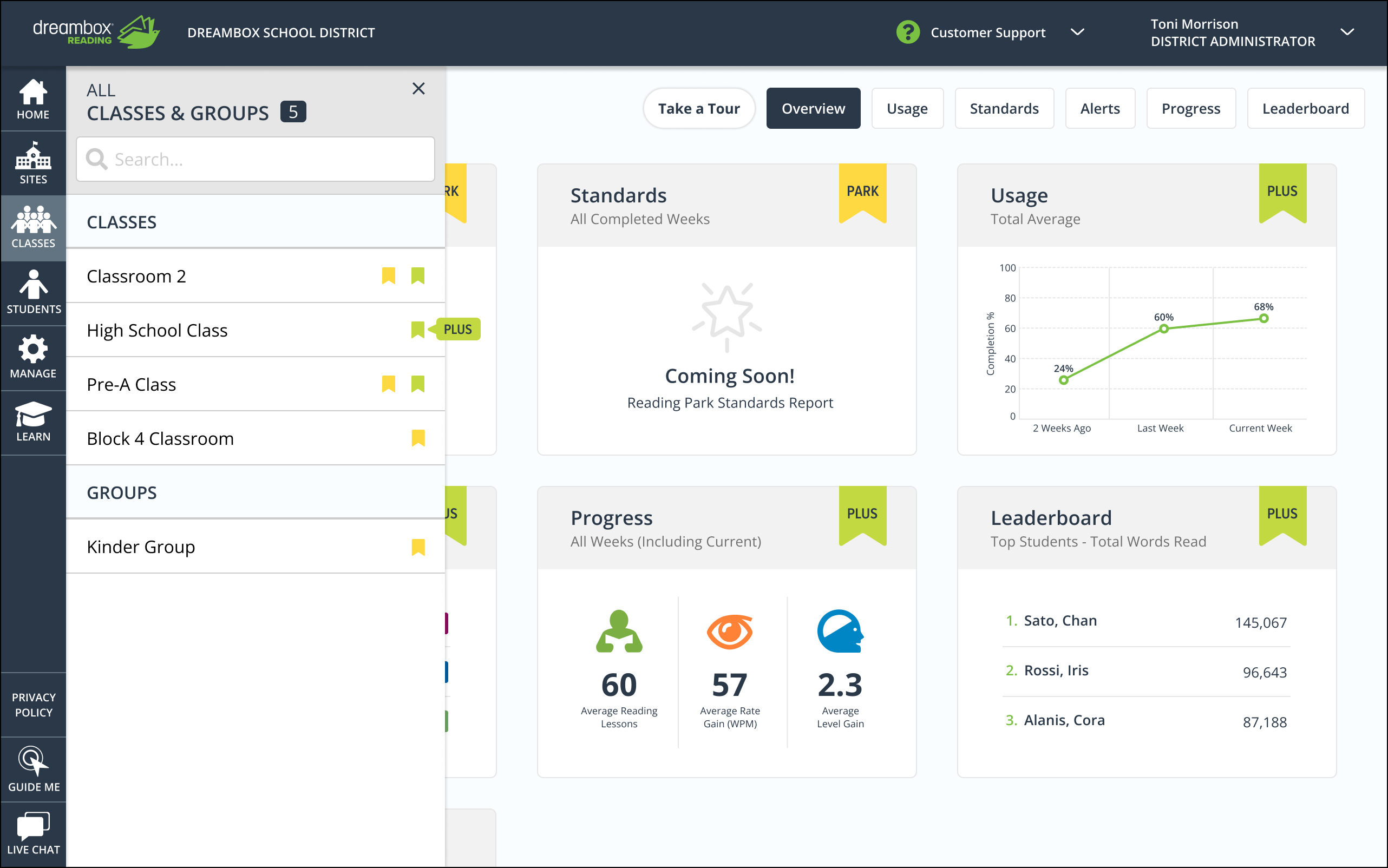
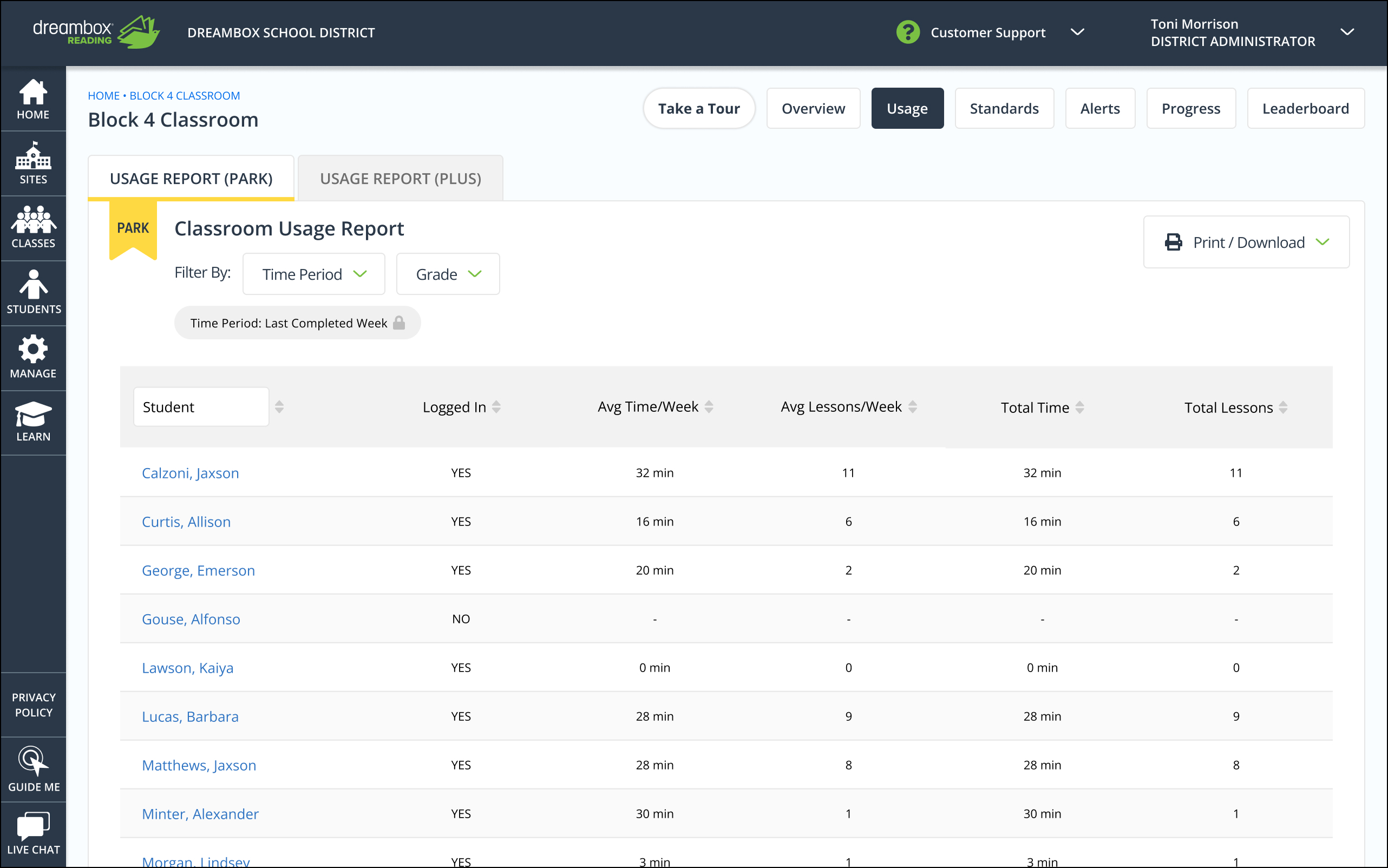
#1 | Added labeled product ribbons onto the dashboard tiles.
#2 | Scaled back the use of color.
#3 | Added tabs in our reporting section.
#4 | Modified the layout of the dashboard tiles and adjusted typography.
#5 | Users with only the Plus product will not see product differentiators and get a similar experience to what they are used to.
#1 | These ribbons act as the core method for product differentiation on the home page.
#2 | This will allow us to use color more meaningfully going forward to draw attention to important data.
#3 | This allows our users to navigate between products on our reporting page while mitigating cognitive load.
#4 | Improved visual design increases readability and builds trust around the experience.
#5 | This follows our, "do no harm" goal to existing Plus customers.
This initiative had a very quick turnaround. The next steps will involve monitoring CSAT and NPS scores to gain insight into the success of the redesign and iterating as needed.
